Friday 21 December 2012
Work - Getting the Chop
Thursday 6 December 2012
Found - Packaging
My favorite packaging is always from the Chinese supermarkets with these little cartons. I am just easily amused with the ranges of colours, names and characters on these cartoon. Plus with the range of flavours at 25p ahead you cannot go wrong for a quick drink!
Voss water comes in this beautiful glass bottle, which is just stunning and stands out a mile in a supermarket. With only being £2 it was rather cheap if you compare it against the price of some of the brand leaders offering less water in a plastic bottle.
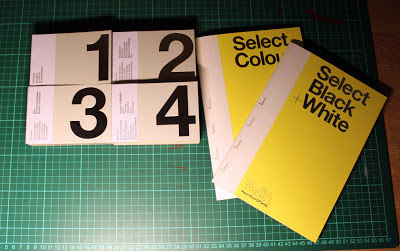
I love paper, so I have started getting samples boxes from a range of paper mills, this one is from GFSmith which comes in this beautiful box. The box feels like a really nice portfolio with all the samples and booklets inside. The design is clean with strong typographic elements. I can just spend hours browsing through and smelling paper. (weirdo).
Sunday 2 December 2012
Travel - Bowder Stone and Lakes
Yesterday we adventured deep into the Lake District to find Bowder Stone, which is basically a huge rock with a stair case attached! (handy!) It reaches up over 30ft high and weighs over 2,000 tons, this stone has not moved in many thousands of years. With great views from the top it is defiantly worth a drive out.
Views driving around the Lake District and back to Carlisle on the iciest of icy roads!
Tuesday 27 November 2012
Monday 26 November 2012
Work in Progress - Unrelated Downer
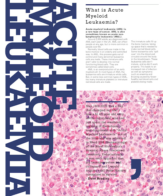
Part of a book I am producing and designing about my fathers treatment and diagnosis of Acute Myleoid Leukemia. These are my very first bits but on screen so excuse the roughness of the design. Going start exploring the design of patterns and typographic in the coming updated layouts. I want the booklet to be a fact file as well as an documentary of my Dads illness and death.
Work - Getting The Chop
A very quick project produced playing with typography. I am not overally happy with the work produced however it has given me ideas for what I want to do within my ISTD project I am working on about my father.
Saturday 24 November 2012
Thursday 8 November 2012
Monday 5 November 2012
Featured - Creative Review
Friday 2 November 2012
Work - ZERO pence
The finished mock up of my Student Magazine for the University of Cumbria. I used patterns and texture background to create a sense of movement and energy. Then I wanted lots of laying and overlapping to again reinforce the energy of student life and life in general. I am overall pleased with the piece of work created however I am looking to explore paper stocks and printing techniques but also how an online version would be visioned.
Shortlisted Edition
Shortlisted Edition
Tuesday 30 October 2012
Work In Progress - Student Newspaper Contiuned
Here are three spreads I am currently working on for our University Newspaper, I am enjoying the interaction between pattern, type and image. I feel the overlapping creates a sense of energy and pace that I want this publication to have. This piece still needs alot of work from small details but also the creation of a contents and front cover as well as some more layouts. Final versions to be coming in the next couple of days.
Sunday 28 October 2012
Work In Progress - Student Newspaper
Currently I am exploring the ideas for a new student publication at the University of Cumbria, here is work created from today. I wanted to explore the involvement of pattern within in an layout to create texture and pace. I really need to learn to free myself up and allow movement within my spreads and not to get everything in line, I feel this will give it an more personal touch but also feel more interesting.
Sunday 21 October 2012
Travel - Old Film
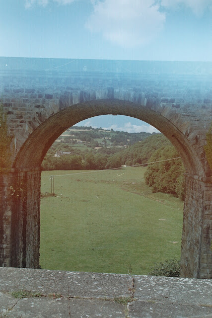
I hardy ever get my films developed the day after taking them, I normally leave them in the spare room for a year or two just too add to the surprise of getting the pictures developed. These pictures range from 2010 - 2011 and I believe they are taken across Wales and around my home in Shrewsbury, Shropshire. I really love the quality of these pictures from how you get light leaks but also with half the frame overlapping. I have another six films to get developed, hopefully I will find some untold story when I collect them from the developers.
Wednesday 17 October 2012
My Dad
Sadly my Dad passed away after a long on and off battle with Acute Myeloid Leukaemia. We found out four years ago that he had this disease and the doctors expected that he would not even get past the first week, however that was not the kind of man my Dad was. He got through the strongest chemos and treatments they could throw at him and then got clear of his first bone marrow transplant. Still he was making stupid jokes about digging an escape tunnel from his isolation room or putting bars on the windows. He was cured.
After a happy year of being away from this terrible disease, it came back. He was put on a trail drug in Birmingham to start treating it and Dad signed up to extra trails for the researchers to see how the drugs affected other parts of the body and so on. This lead to his second bone marrow transplant which took place over the summer which was successful for a couple of weeks. Sadly something went wrong and Dad was unable to win this battle.
I am proud of my dad for everything he did and the ambition he had to do.
Order of Service
I set myself the challenge to create the program for his funeral. (As the funeral directors designer did not understand kerning for a start). I decided to go for a clean, understated design. As I wanted to explore my Dads treatment in my final major project at university. My dad kept a record of most of the treatment they gave him which I feel is a wealth of knowledge/data that just should not decay on a memory stick somewhere.
After a happy year of being away from this terrible disease, it came back. He was put on a trail drug in Birmingham to start treating it and Dad signed up to extra trails for the researchers to see how the drugs affected other parts of the body and so on. This lead to his second bone marrow transplant which took place over the summer which was successful for a couple of weeks. Sadly something went wrong and Dad was unable to win this battle.
I am proud of my dad for everything he did and the ambition he had to do.
I set myself the challenge to create the program for his funeral. (As the funeral directors designer did not understand kerning for a start). I decided to go for a clean, understated design. As I wanted to explore my Dads treatment in my final major project at university. My dad kept a record of most of the treatment they gave him which I feel is a wealth of knowledge/data that just should not decay on a memory stick somewhere.
Monday 15 October 2012
Work In Progress - Carlisle Photo Festival Website
Currently I am working on the Carlisle Photo Festival website at home (reason why I am at home will be explored at a later date). This web site is in the early days of the design process however I want to include a strong secondary colour to give some life to the framing of the image. As well this green is backed up with a light pattern background aims to give a bit of texture and energy to the composition, Which I feel works quite well with the imagery. The bottom dark grey bar will be hidden at the bottom of the page acting as a site map and secondary menu. At the moment I am finding it difficult to get the correct balance between the colours but also the image. More to come on this project.
Friday 5 October 2012
Work - Monograph Layout 2
 |
| Front Cover |
Subscribe to:
Posts (Atom)


