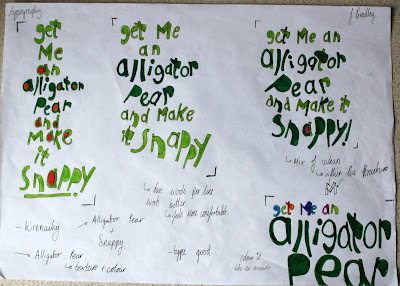
Here we were set rules with only using one typeface like the top piece and only using two typefaces with two sizes like the bottom one. I am really pleased with the top with how the piece flows together However the bottom one feels like two different stories and needed bringing together. Apparently I managed to put personality and a mood into them so I am rather pleased with that. 62
This project did not go very well, my info graphic wasn't very clear with what it was trying to communicate and also could of done with different weightings of line and a better structural layout. I like the colours in the water colour but the white wind turbines look like someone has just stolen them off the landscape. 58
This project is all about analogue and digital image making first we start with cutting up shoes then photograph them. Then the next stage will be to draw/paint/tape on top of them.
I really like the colouring in these images, look like they are out of some 1920's horror films with the low key lighting. These last three are all multi exposures which I think have worked rather well. I especially like the first one in the three with Robert looking over the river.
35mm photography from my Diana f+, really like how most of the images link together due to the developer. I really love the colours in these images, especially the 3rd one down, the greens are just great.
Just playing around with some new pens I recieved for Christmas and food colouring. I like the strokes which form the body of the bird and the background where I have left the colouring to settle naturally.
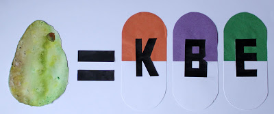
This was my Pattern out come, I am overal pleased with it. The Avocados should of been scaled up however I am super pleased with the colouring I chose for it. I feel it expresses the history of the fruit. I found the food photography so hard, however I am pleased with the image. This image is to dark on one side, but this has helped me see problems with lighting for next time I do any still life work. These were my Surreal pieces, they are aimed at children and I just wanted to turn the Avocado into some kind of Dinosaur/animal that children might like. I personally really like them and would love to make some knitted or stuffed version of them. Here is my Illustrative piece and I want to express what kind of health and vitamin benefits Avocados actually had. So I came up with this really simple maths equation however I feel it would of worked alot better if the Pills looked more like Pills. So I needed to improve on the quality of line represented. Layout Pads (Selection) The layout pages are my favorite part of any project but with this one I got really carried away. I would of uploaded them all up but it would of just absorbed the whole site. I really love the energy and passion expressed from the colours and drawings. 72
This project we had to do secondary research into our chosen fruit and vegetable then present it in a personal way. I chose to do all mine in hand drawn/painted so I could control every element of my pages. Here is a selection of pages out of the ten. 65