
 My last session with the life model, really enjoyed the fast abstract images I created at the top. Also really enjoy using tone to create the black and white image.
 My last session with the life model, really enjoyed the fast abstract images I created at the top. Also really enjoy using tone to create the black and white image.

 Had to create two final pieces for my subject of Invisibility, one had to be vector and the other some of source which i chose digital collage. Not completely happy with the layout of the work or the scale which my tutors pointed out. As this piece of work was all about scale of invisibility. 65
 Look at this cutie I found in Carlisle Train Station today whilst doing some filming for my count down project.

 My diana sadly suffered from some light leaks and made this film go all weird. The film was also out of date by a while which probably also did not help the final quality! Will have to try again though = D.
 Today we were doing some quick drawings about structure and tone then went on to look at white on black which I really enjoyed. Really like the shapes of the quick drawings on the top, kinda reminds me of the strongbow logo.
 This project we had to design an album booklet for a given song, my song was You! Me! Dancing! by Los Campesinos. The aim of the project was to show we understood empathy of the subject but also to show what we have learnt so far in the year. My design had to be full of energy and excitement that I feel I hit, however I feel it would of looked better if it was all handmade like the image I created below. This design would of benefited from a cd design as everything builds up to the cd and its abit of a disappointment when you get there. 68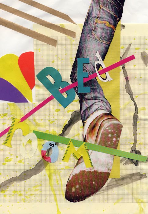


 Today we were playing with tone and more structure. I choice to use ink, just because it is great fun = ).


 Exploring structure in our first lesson then we will be going on to tone and different medians in next weeks lesson. Totally forgot how much I enjoy life studio.
 This project we had to use indesign to come up with an layout for our image and set text. This piece needs abit more emotions and movement. 65

 Here we were set rules with only using one typeface like the top piece and only using two typefaces with two sizes like the bottom one. I am really pleased with the top with how the piece flows together However the bottom one feels like two different stories and needed bringing together. Apparently I managed to put personality and a mood into them so I am rather pleased with that. 62

 This project did not go very well, my info graphic wasn't very clear with what it was trying to communicate and also could of done with different weightings of line and a better structural layout. I like the colours in the water colour but the white wind turbines look like someone has just stolen them off the landscape. 58

 Here is my first go at Silk Screen Printing, really enjoyed it, cannot wait to do alot more.


 This project is all about analogue and digital image making first we start with cutting up shoes then photograph them. Then the next stage will be to draw/paint/tape on top of them.

 I really like the colouring in these images, look like they are out of some 1920's horror films with the low key lighting.

 These last three are all multi exposures which I think have worked rather well. I especially like the first one in the three with Robert looking over the river.


 35mm photography from my Diana f+, really like how most of the images link together due to the developer. I really love the colours in these images, especially the 3rd one down, the greens are just great.
 Just playing around with some new pens I recieved for Christmas and food colouring. I like the strokes which form the body of the bird and the background where I have left the colouring to settle naturally.


